


Propoganda Study Pt 1: The Chinese Cultural Revolution
Welcome to my Propaganda Study series! In this collection, I will thoroughly explore how common people were influenced by their surrounding governments through general typography, text hierarchies, and other aspects of design through propaganda. This post will cover the infamous Chinese Cultural Revolution, a period which displayed Mao Zedong's rise to power and unwavering grip over China's people over a period of 10 years, from 1966 to Mao's death in 1976. The graphics prevalent throughout this era gave an image of a prosperous and thriving nation - masking the suffering of millions in reality.
Linked with the earlier campaign known as "The Great Leap Forward", Mao's plan for the nation of China was to transform the country into a booming, industrial society moving in the direction of the future rather than staying rooted in tradition, which horrifically backfired (This period of "abandoning tradition" is known as the Cultural Revolution). One iconic symbol throughout this period in history was the image of Mao's "Little Red Book", a collection of quotes that served as an ideological rulebook for his regime. In posters planted across China during the Cultural Revolution, some of them show images of subjects holding the book in glee, a carefree image during the period of a major struggle, marked by famine and general oppression.
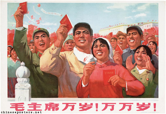
Spread by the CCP at the time, the Little Red Book (modern copy shown on the left) spread Mao Zedong thought across China, written in short bursts. As earlier said, the book was mainly a compilation of quotes that were simple enough to be implemented into songs and drills. It remains as the most printed book globally during the 60s-70s, about a billion copies produced. As seen already in the examples provided, red was a color that was impossible to avoid during the Cultural Revolution, being a symbol of revolution; Mao's military troops named the Red Guards. One infamous story regarding the Red Guards is that they even changed the red and green traffic lights around, red meaning "go" rather than stop. Quotes throughout posters during the Revolution were mainly in red, not only emphasizing the importance of the statement, but also cementing the image of the color in their minds as one of prosperity and innovation.
Recognize further how the Chinese characters here are far more blocky than the traditional type, signifying the ideal "modernity" spread around at the time. Type was often repetitive and posters were composed of a main caption of red text against a white background, the contrast immediately catching eyes. Here are a few more examples shown.


Take note of the emphasis on central figures throughout these posters, where Mao is largely the focus of them, and if not, it's those promoting his ideals. As time progressed, there was an unshakable cultural sweep across the nation, influencing any sort of artform in the nation.
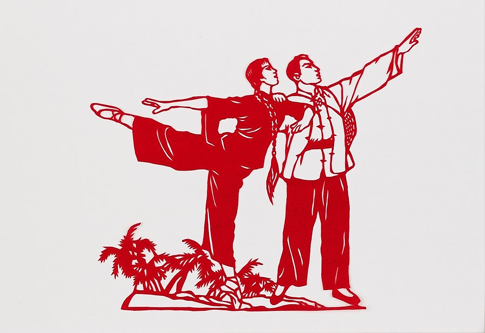
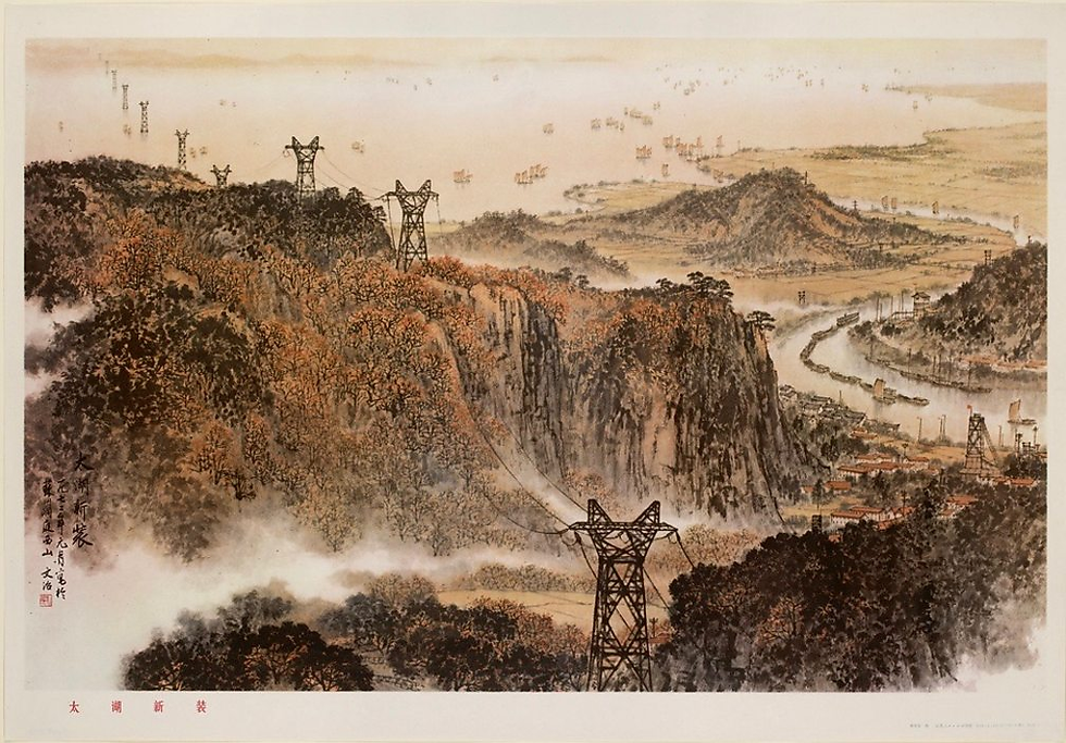
With this series, I enjoyed educating myself of places far from my own home, tracing back history in finer details that I haven't really noticed before. Chinese design in particular has been a recent interest of mine, a country with monumental global power and ancient history. Accompanied by both astounding historical sites plus incredible innovation through the bustling cities of Shanghai and Chongqing, it's a country that has an endless sea of inspiration. Hope you enjoyed this one, it has been a while in the making!
Goodbye ☻


Comments