


Exploring Islamic Calligraphy
As being a young person with many years ahead of me, I always try to seek out knowledge in educating myself on regions of the world that I eventually plan to visit. Coming from a place so far removed geographically and culturally, I’ve recently found myself fascinated by Middle Eastern arts—especially the beautifully intricate Arabic alphabet. Even without being able to read it (to my great misfortune), its alphabet is so incredibly expressive with its fluid lines and ancient elegance. What amazes me most is how, throughout its development, Arabic script has branched into so many unique styles. Some were created for architecture, some for royal decrees, some for poetry, and some have vanished with time. Yet each carries a trace of the era and culture that shaped it.
Arabic script is still incredibly influential today, remaining the second most widely used alphabet in the world. It isn’t just tied to Arabic itself; many languages rely on it—Persian, Kurdish, Urdu, and Malay, to name a few. Across all these regions and histories, calligraphy became not just a writing system but a visual language of its own.
One of the earliest styles, Kufic, emerged in the city of Kufa and is instantly recognizable for its sharp angles and geometric strength. Created well before the modern printing press (3-4th century A.D), it’s the script you often seen carved into decorating the walls of early mosques—bold, square, and deeply architectural. Originally written for stone surfaves, the Kufic style can be seen among early scripts of the Q'uran. Over time, it developed variations like floral and square Kufic, each as visually striking as the last. This style eventually died out sometime towards the end of the 13th century.

Characteristics of Kufic
Angular letter shapes
Short, broad vertical strokes
Used colored dots around letters to aid pronounciation
Written on a horizontal baseline
As the need for everyday clarity grew, so did Naskh, a script known for its extreme expression, and also served to be the main inspiration of why I wrote this post in the first place. The Arabic alphabet itself can often morph into artworks when written in this style, Naskh remaining still in use today, being developed in the 16th century. This became the go-to style for official government documents, such as proclaimation scrolls, endowments, and land grants. What you may think is how exactly can someone read these? Funny enough, the illegibility in the Naskh style became largely useful, as being a means to insure confidentiality, also to prevent forgery.

Characteristics of Naskh
Wide spaces between lines
Ascending lines right to left
Large, decorative letters are accompained with dots in a veil of detail
Then there’s the essential plus powerful Thuluth script, considered to be the most versatile and professional technique of Arabic writing. With sweeping curves and tall vertical strokes, this style is often noted for its legibility, being used in a large number of texts today. Historically used for monumental inscriptions and religious architecture, it embodies a sense of ancient grandeur that makes it stand out from the quieter, more practical scripts.
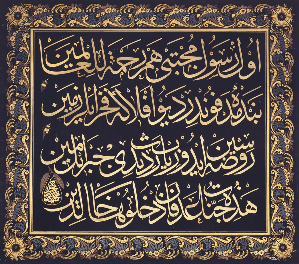
Characteristics of Thuluth
Left vertical strokes, deep horizontal curves
Written with interlacing letters
Descending letters have a hook pattern
In summary, the Arabic language can serve as a historical teacher of sorts when approaching typography, an approach to calligraphy that requires immense attention to detail plus text hiearchy, being a language with such versatility. The website https://www.calligraphyqalam.com/ was the main source for this post, highly suggest a visit as there are many other styles to explore... see you next time!


Comments