


Drop-Caps: Look at me!
Ever come across reading a book or magazine with a large and ornate letter next to the paragraph, immediately catching your attention?
This is the mark of the drop-cap, a stylization that predates before the printing press and moveable type, impossible to ignore in ancient book designs (an example shown here in a page from the Icelandic Sagas manuscript, dated to the year 1005).

As history and the art of typography advanced over time, there have been various methods in how to use dropcaps. These different methods are the Baseline and Hanging Initial cap techniques.
Referring to the line in which the text sits on, the Baseline Initial cap sits on this baseline, allowing for smooth reading and is oftentimes not too enlarged. This technique tends to be easier to create as well, not needing to shift the text around in any way.
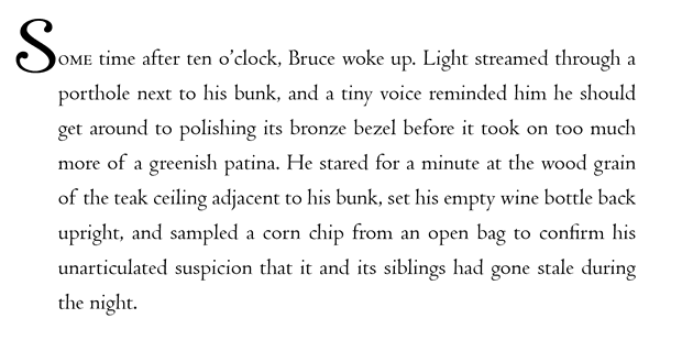
And lastly, there is the Hanging dropcap, hangs from the top of the letters in the paragraph and merges into the paragraph, which can become more difficult to pull off than other types.
An example of this type is shown down below.

Unfortunately, the rise of modernity discourages using these precious letters of decoration, claiming the risk of “hosting typographical problems”. I think they should very much stay, as all of the times I had enjoyed reading, they have been a trademark of immersing yourself into the world you’re about to be launched into, and creates a far more memorable experience rather than simple text. Chapters are usually composed of one large letter, the title of the said chapter, then straight into the text. I think the initial caps, no matter if the novel or article is bad enough, grabs attention in its originality.


Comments