


About Baskerville
- Sep 3, 2025
- 1 min read
Created as a Serif font in 1757, Baskerville was developed by... John Baskerville. Later on, it was cut into metal by punchcutter John Handy. With its delicate, near-gothic endcaps, I think this font has some quiet beauty to it that is largely overlooked, as Times New Roman is far more popular and bears somewhat of a similarity.

As shown here, Baskerville is similar in its composition to Times New Roman, yet the ends of the letters in Baskerville are more stockier at the ends and thinner in the middle, where Times is more uniform across. It could be for this very reason that Times is used more widely and has been with me through one essay after another, while Baskerville has not. Created also much earlier than Times, it can be assumed that if not for Baskerville, Times would not have existed. Having just the right amount of curves, I enjoy using Times more than a flat, quite boring font such as Arial or Calibri, which is unfortunately the default for Word, and find myself using it by accident.
The presence of Baskerville can be seen in famous examples such as these:
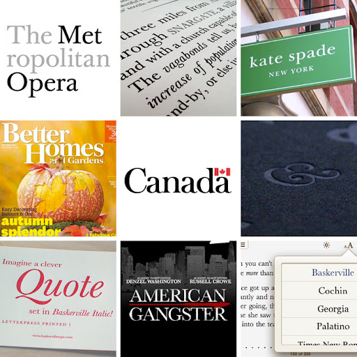
Funny how the Canada logo is in Baskerville, and it's always exciting to pick apart different fonts in the surroundings of everyday life, something that I have grown accustomed to upon taking a Typography class in college. Recognizing fonts largely affects how I create my own works, and in what situations each one is needed.


Comments